Storybook – The Ultimate UI Component Development Tool
Storybook is the industry-standard open-source tool for developing UI components in isolation. Used by teams at Airbnb, Lyft, and GitHub, Storybook transforms how frontend developers build, test, and document user interfaces for React, Vue, Angular, React Native, and other modern frameworks. It creates a dedicated sandbox environment, allowing you to focus on one component at a time without the complexity of your full application.
What is Storybook?
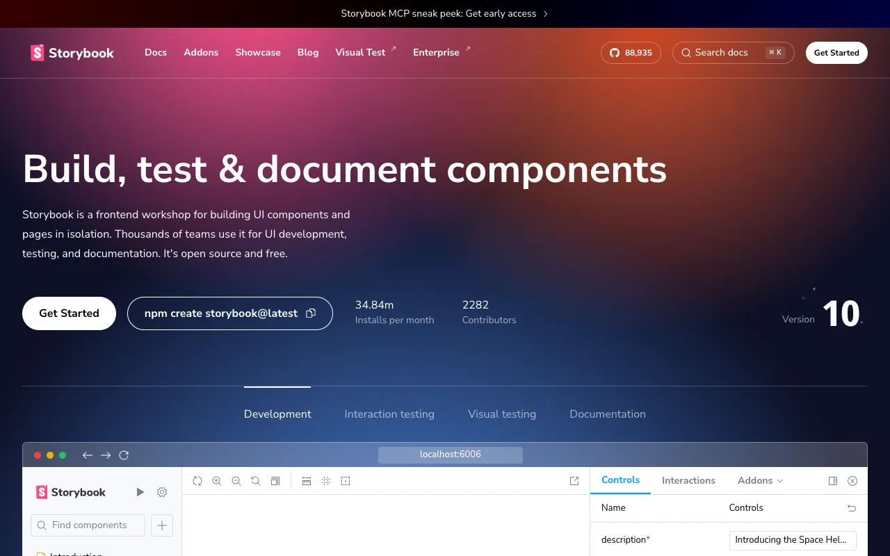
Storybook is a frontend workshop that enables developers to build UI components in isolation from their app's business logic and context. Think of it as a visual development environment and component library manager. Instead of running your entire app to see a button or modal, you develop and test it independently in Storybook. This methodology leads to more reusable, robust, and well-documented component libraries, dramatically improving development speed and UI consistency across large-scale applications.
Key Features of Storybook
Component Isolation & Sandboxing
Develop components in a clean, isolated iframe. This eliminates external dependencies and app state, allowing you to perfect a component's appearance and behavior in every possible state (loading, error, empty, etc.) before integration.
Visual Testing & UI Review
Catch visual bugs automatically. Storybook integrates with visual testing tools to snapshot every component state (story). CI/CD pipelines can detect unintended UI changes, making code reviews faster and more reliable by focusing on component 'stories'.
Interactive Playground & Controls
Dynamically interact with components using auto-generated controls (formerly known as Knobs). Tweak props like text, colors, or data on the fly without writing code, perfect for designers and developers to experiment with edge cases.
Comprehensive Component Documentation
Auto-generate living documentation from your code and stories. Storybook's Docs addon renders your components alongside their usage guidelines and prop tables, creating a single source of truth that stays updated with your codebase.
Powerful Addon Ecosystem
Extend Storybook's functionality for accessibility (a11y), design system integration (Figma, Sketch), performance testing, and more. The rich addon marketplace tailors the workshop to your team's specific workflow.
Multi-Framework Support
A unified workflow across your stack. Storybook provides first-class support for React, Vue, Angular, Svelte, React Native, HTML, and more, making it the perfect tool for polyglot frontend teams.
Who Should Use Storybook?
Storybook is essential for any frontend developer or team building modern, component-based web applications. It is particularly valuable for: UI/React/Vue/Angular Developers building reusable component libraries; Design System Teams creating and maintaining documented design systems; QA Engineers performing visual regression testing; Product Teams who need to review UI states independently of backend logic; and Open Source Maintainers who need to showcase and document their UI components effectively. If your project uses components, Storybook will improve its quality and your workflow.
Storybook Pricing and Free Tier
Storybook's core tool is 100% free and open-source (MIT licensed), with no usage limits. This includes all core features for developing, testing, and documenting components. For enterprise teams, Storybook offers paid cloud services like Chromatic, which provides hosted visual testing, UI review workflows, and publishing for component documentation. The free, self-hosted version of Storybook is production-ready and sufficient for most development teams.
Common Use Cases
- Building a reusable React component library for a large SaaS application
- Visual regression testing for Vue.js components in a continuous integration pipeline
- Creating living design system documentation for an Angular enterprise project
- Developing and showcasing UI components for an open-source NPM package
- Isolating and debugging a complex data table component independent of app state
Key Benefits
- Accelerate UI development by focusing on one component at a time, reducing cognitive load.
- Improve UI consistency and reduce bugs by developing reusable, well-tested components.
- Streamline collaboration between developers and designers with a shared visual reference.
- Automate visual testing to catch unintended style changes before they reach users.
- Create always-up-to-date, interactive documentation that improves developer onboarding.
Pros & Cons
Pros
- Completely free and open-source for core development workflow.
- Unmatched ecosystem with addons for accessibility, design, and testing.
- Framework-agnostic support for all major frontend libraries.
- Fundamentally improves UI development methodology and component quality.
- Excellent for creating a single source of truth for component documentation.
Cons
- Initial setup and configuration can have a learning curve for new users.
- Primarily focused on component development, not full page or application flows.
- Advanced cloud features (like Chromatic) are a separate paid service.
Frequently Asked Questions
Is Storybook free to use?
Yes, absolutely. Storybook's core tool is 100% free and open-source under the MIT license. You can use it for developing, testing, and documenting components without any cost. Paid services like Chromatic offer additional cloud-based features for visual testing and publishing.
Is Storybook good for React development?
Storybook is considered an essential tool for professional React development. It originated in the React ecosystem and provides first-class support, making it the gold standard for building reusable React component libraries, performing visual testing, and maintaining design systems.
Can I use Storybook with Vue.js or Angular?
Yes, Storybook has excellent official support for Vue.js, Angular, Svelte, and many other frameworks. The workflow and core features remain consistent, allowing teams using different technologies to share the same development and documentation practices.
How does Storybook help with testing?
Storybook facilitates multiple testing strategies: Visual Testing (catching UI regressions), Interaction Testing (verifying component behavior), Accessibility Testing (with addons), and Documentation Testing (ensuring examples work). It isolates components, making them easier to test in controlled states.
What is a 'story' in Storybook?
A 'story' is a single state of a component. For example, a Button component could have stories for 'Primary', 'Secondary', 'Loading', and 'Disabled' states. You write stories to showcase and test every way a component can be rendered.
Conclusion
For web developers building modern, component-driven user interfaces, Storybook is not just a tool—it's a best practice. By enabling isolated development, it leads to more robust, reusable, and well-documented components. Whether you're a solo developer on a React project or part of a large team managing a multi-framework design system, integrating Storybook will significantly elevate your UI development workflow, testing rigor, and team collaboration. Its powerful free tier makes it accessible to everyone, solidifying its position as the indispensable workshop for frontend developers.